Background
Reason for Redesign
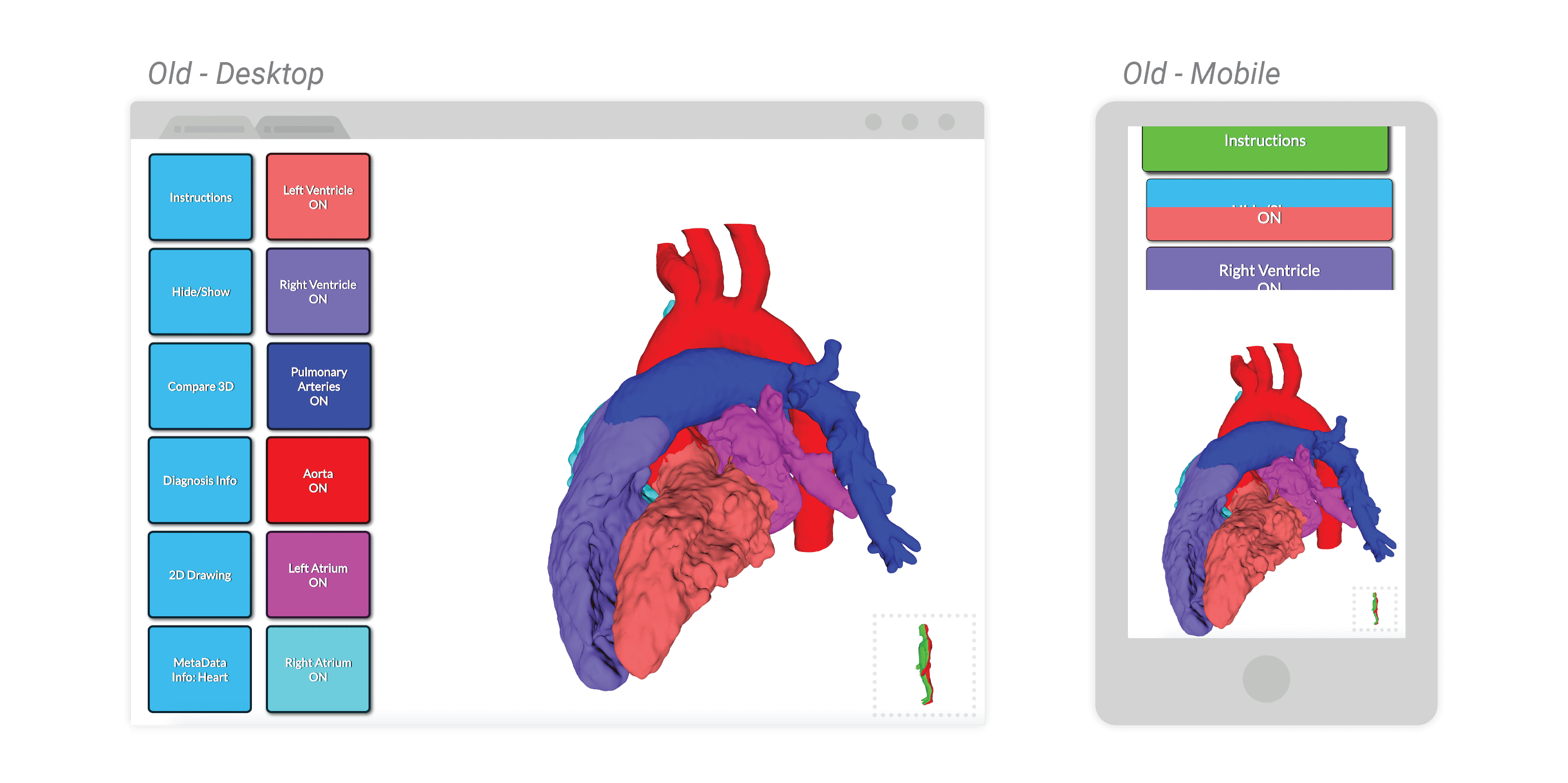
The website I was tasked to improve allows patients and their families to view and manipulate models produced from their own MRI scans along with diagnostic information and general health information. The inciting factors behind its redesign were a few outstanding complaints from patients and administrators:
- The website did not scale well to mobile and tablet size
- The desktop site, which represented a majority of users, felt like a mobile site
- The design felt outdated and overly childish for official diagnoses
Design
Redesign Changes
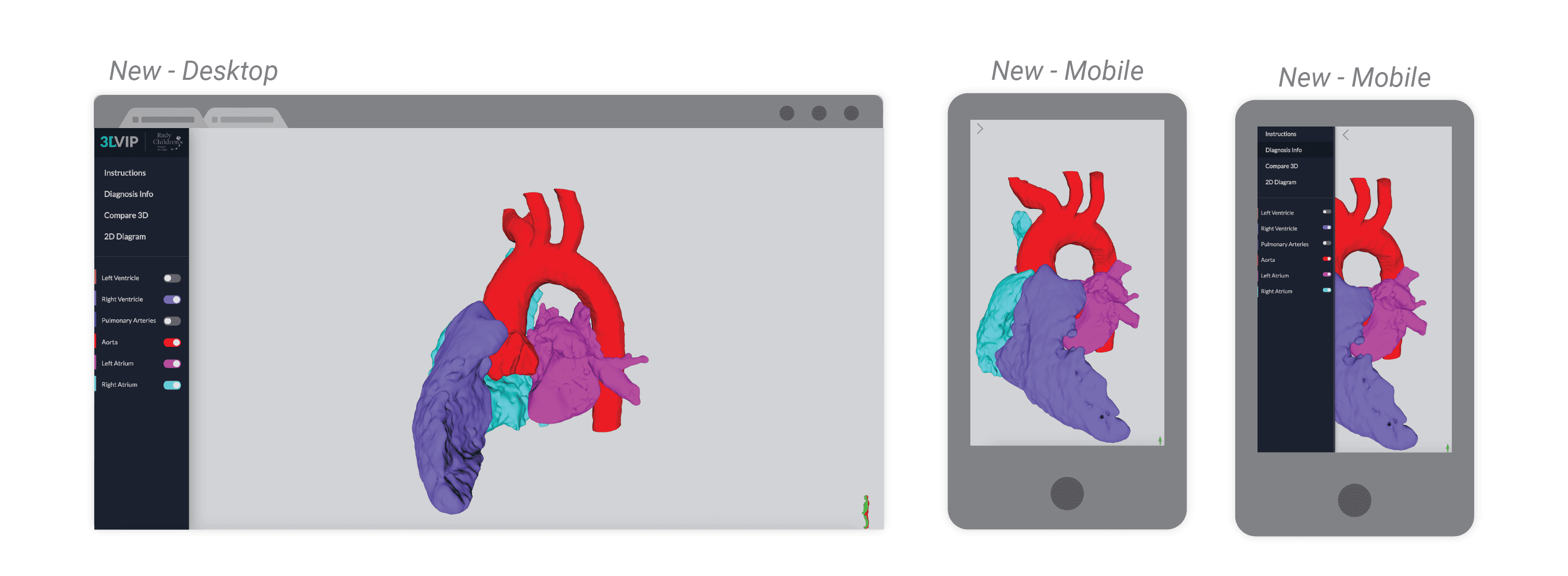
I approached the redesign from a few different angles. The primary concern raised by Justin (the head of the 3DI Lab) was the visual clunkiness of the interface and components so I went forward to address that first. The plan was to compress the button array on the left side into a more concise but expressive sidebar that could be present on tablets and drawn in/out on mobile devices. This clears up more space to allow the model (the central feature of the platform) to be as large as possible. Popups were also shrunk from full screen behemoths that took up all visible area to moveable and closeable windowed boxes.
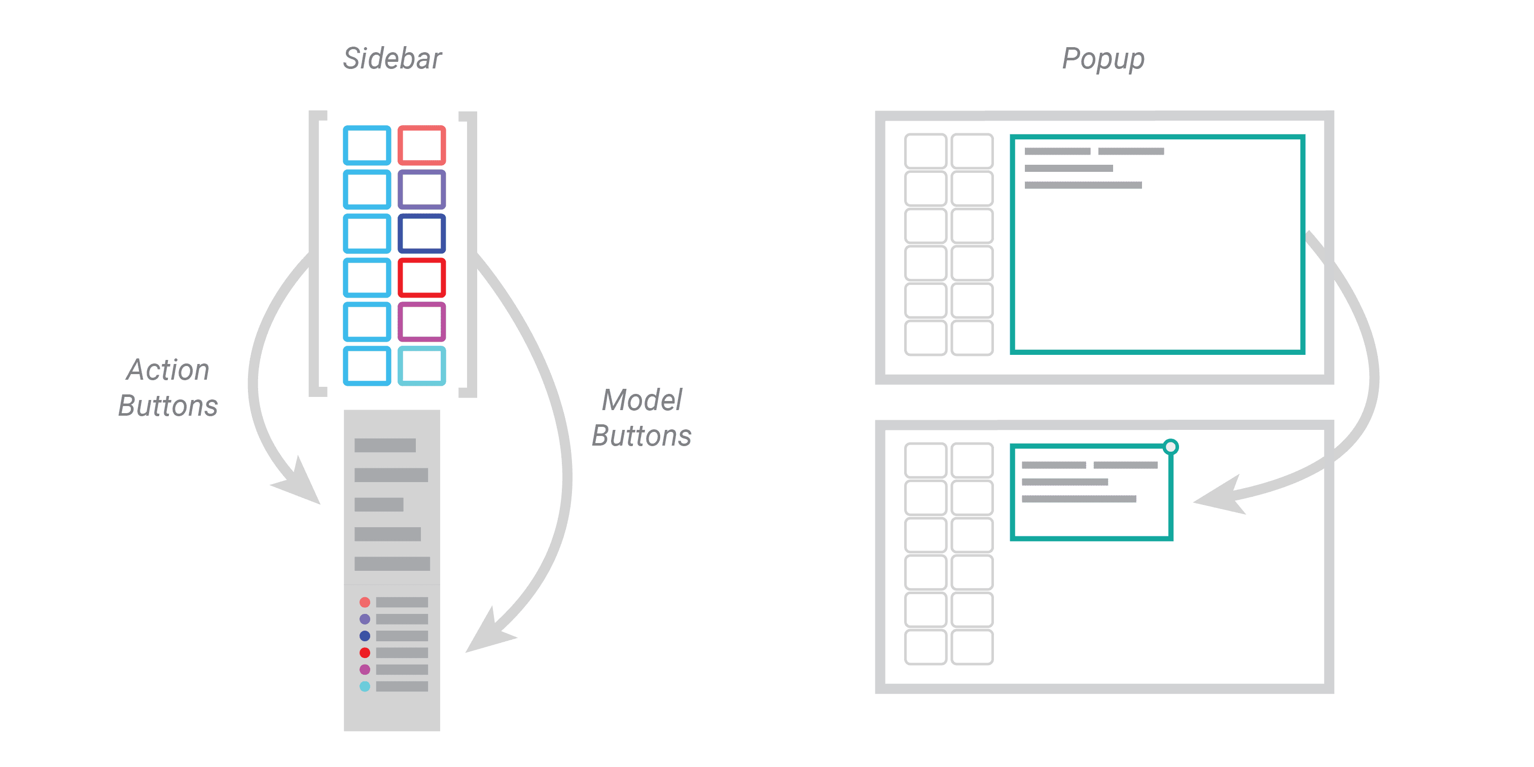
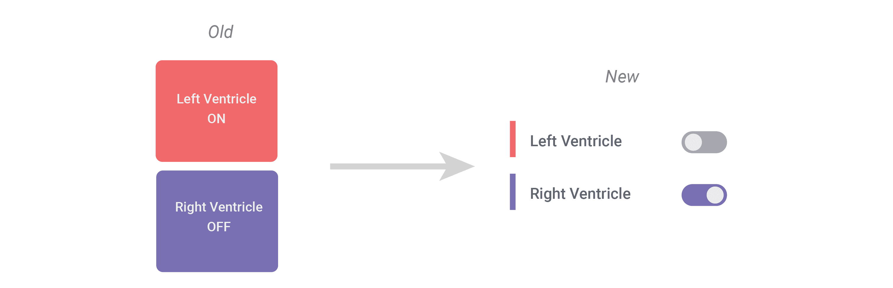
While touch targets did shrink by ~30% across the board, the trade off is that there's clearer differentiation in what each button does and represents. Action buttons that control/pop up diagnosis information, instructions, and meta data are different in shape and color than model toggle buttons that control what parts of the model are visible. Having the windowed information boxes allows the viewer to see the model and diagnosis at the same time. As a byproduct, it also became a lot easier to see which components were currently toggled off, as shown below. I also simplified the color scheme so to highlight the model toggles, as everything else was turned to gray scale.
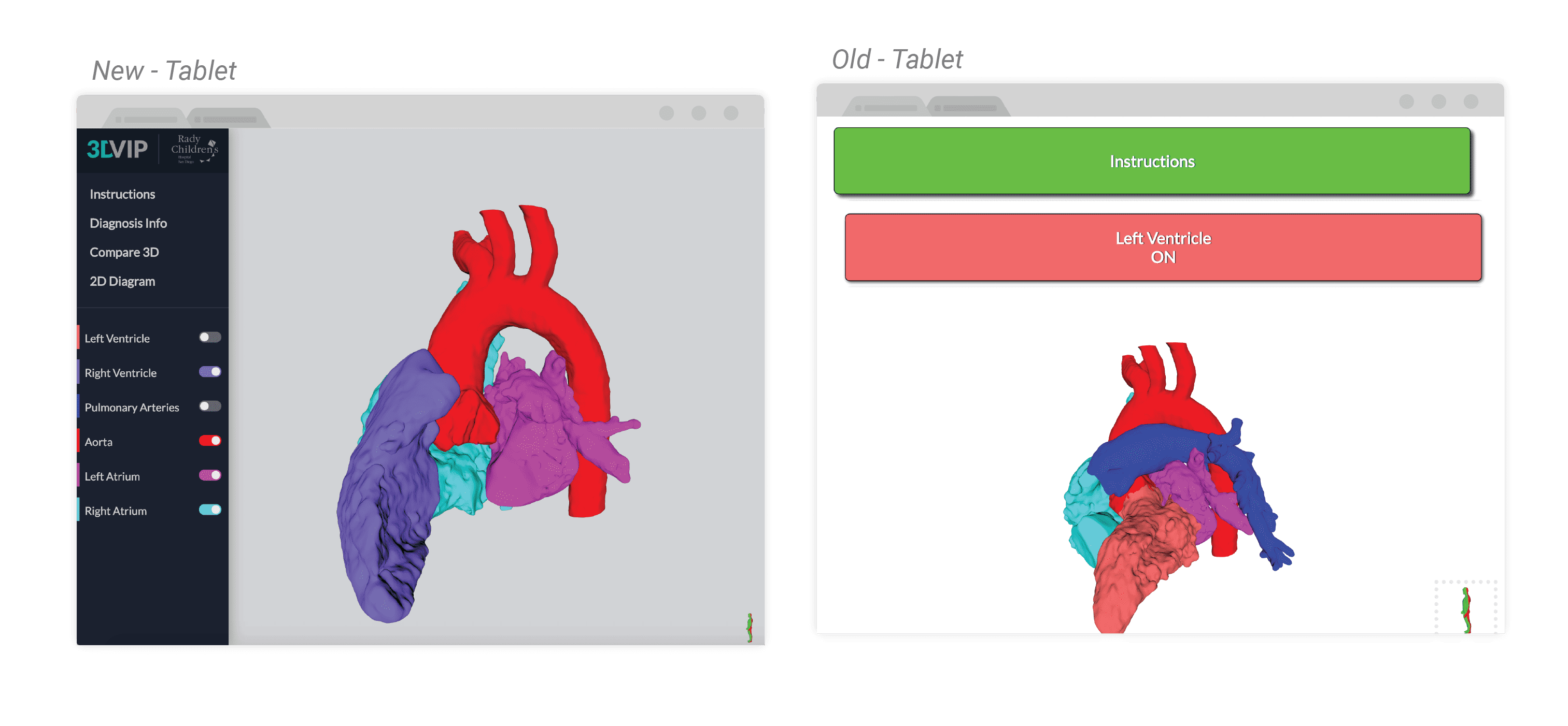
Comparison
With all of the changes taken into effect, here is the final product. This is a fully programmed and deployed website currently in user testing. I did all of the modification work in X3Dom (hence the name of the project) and Javascript.
Tablet
Desktop and Mobile
Next Steps
Physical Interaction
I've since begun work on a new version of the application that is able to sync data between a physical heart model (with an embedded gyroscope) and the webpage with data overlays. Data is transmitted from an Arduino over USB Serial to a local Node server on a computer running Johnny Five JS that receives GET request from the client. I've gotten the physical transmission working, but need to finish the data overlays before it is more useful than just dragging a heart on the computer